2014 IN REVIEW

2014 In Review Art Doodles & Projects Along the Last Year

2014 was defiantly a crazy year! Full of adventures and excitement (to a minimal though, haha!) and I actually got a lot of art done. I finished 10th grade and started 11th, and that summer in between I began the process to become a published artist. I'll be making a post about that in a bit, but right now I'm going to post a bit about the art I've done in 2014. 

Character Developments

For five years I've been creating a graphic novel about our racial, sexual, and human issues on our Earth. That means five years of developing a story.  It wasn't until this past year that i decided to totally redo the characters of the graphic novel, and then ad some. Below are a few characters and what they changed to. 
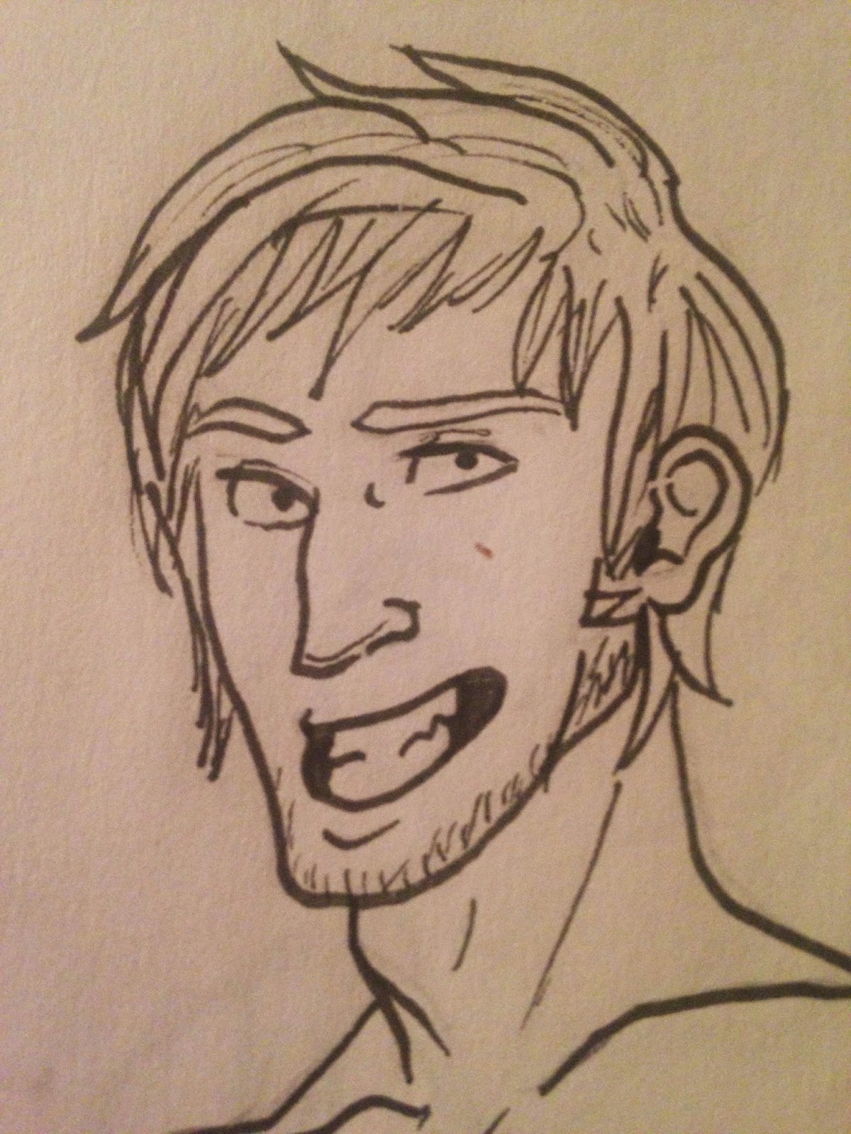
© Ryann Jensen© Ryann Jensen

←Character One→

© Ryann Jensen

© Ryann Jensen


←Character Two→

© Ryann Jensen


←Character Three→


Those are just three of the examples I had on me at the moment. As you can see, the top two are what changed the most. I thought they were too similar and had no diversity in it, which is the main subject and theme of my graphic novel. When developing characters, you really do need to think about how your audience want to see your characters, and how they make sense in the story.

School Assignments

School was alright, I only get one art class per term, so my art was limited to what was in the class in sophomore year, but first term of Junior year I was able to expand my imagination. One art piece I did that I particularly likes was my Virgin Bride. It was done over the course of a month and was done entirely in pastels. 
© Ryann Jensen
One of my favorite subjects is placing pop culture figures into religion, and vice versa. I've always have had a facination with religion, but am not religious myself. I love experimenting and placing fictional people into places where the normal person would deem odd. The Bride from Frankenstien is a classical character that everyone knows, and is an important female roll in the Universal world. Of course, so is Mary the Virgin, in the religious world. So two and two were put together to create this. 

Another project I did was my own project, where the teacher set us free to do whatever, in whatever drawing media. I chose to draw my take on Aphrodite. Mythology was a religion before it was deemed pagan and the Christian world took over, so I also have a peaked interest in that. I drew Aphrodite as a mortal, not as a flawless goddess. However, I did include many of the symbols relating to Aphrodite, such as the doves, the swans, and the golden apple.

© Ryann Jensen

I am thinking about going back and changing her face up a bit, as I don't think it matches the style I was trying to achieve, and I would like to also go back and fix some of the drapery and make the doves more prominent. I think I would also soften up the pencil lines, although I am someone who loves to be able to see individual strokes in art, whether it's paint strokes or pencil. If you have any ideas or opinions, comment below, please!

Criticism is always welcomed! Thank you for watching over my 2014 review!

Word Count: 577

COLOR HARMONY

Color Harmony And Using it to the Best of Your Ability


Whether digital art or traditional art is your forte, the color coordination of your art is VERY important! Don't just think you can pick a green from a crayon box and then a yellow. And you can't just change the hues of the colors to make them fit together either. You have to use complementary, secondary, primary, triadic, and related colors. Now, most of us want to take all the colors in their purest, most dominate stage and stick them together, like pure green and pure purple. We think that because they're both nominate colors that they'll fit well. Or that two cools and too warms make a great combination. Again, this accusation is false.

What Are the Color Coordination and Harmonies?

First off, the Color Coordination

You may want to skim this article about the coordination of color. The most basics are primary, secondary, and tertiary colors. Primary colors are of course you red, blue, and yellow. Secondaries are what you get when you mix two of the primaries: purple, green, and orange. Tertiary colors are what are what you get when you mix one primary with one secondary: orange-yellow, yellow-green, green-blue, blue-purple, purple-red, and red-orange. 

Now, the Color Harmonies and Schemes

There are three simple simple color harmonies: complementary, analogous, and triadic. Complementary is the two colors right across from them (i.g. red is across from green). Analogous is when you have colors right next to any color (yellow-green, next to green, next to green-blue). Triadic is when three color make a sort of triangle (orange, green, and purple). 

Then there are the three more complicated harmonies: Split Complementary, Rectangular (tetradic), and Square. Split Complementary is just like the complementary colors, but the diagonal is split into two. So if red is a color you pick, yellow-green and green-blue would be your Split Complementary. And then Rectangular (tetradic) colors are colors are two complimentary pairs (red and green, yellow and purple). Square harmony colors are almost exactly like Rectangular, but supply a wider variety of colors, as they are evenly spaced. The hardest to tackle is the Square harmony colors. 

 How Do You Use Them?

With this tool, they are quite easy to use. This tool uses the color wheel and gives you the basic Harmony chapes (triangle, square, oval, etc.) so it will over the hues that do not work well with the harmonies. For your art, only pick what is inside the shape. Continue to do this until you have learned well enough of what colors go well together, and what colors do not. 

I really hope this helped you! I know that when I started this technique and started playing around on it, I really did begin to understand the color harmonies and schemes easily! Though I still use the tool that is linked both above and on my sidebar (under 'Lists'), I know that I know my harmonies well enough to not use it (though I use it mostly for comfort as I want to make sure I have the color that best fits my art). Happy painting!

Word Count: 526

LIFE AND ART

Bringing Art Into Your Life And Why It's Important

Chances are, your mom has brought a $500 painting into your house at some point and you've thought to yourself "The heck is the point in that? Hang it on the wall and what? Stare at it for an hour?" And yeah, it seems pretty boring and unnecessary at first, but decorating your home can be pretty satisfactory.  Humans surround themselves with things that express them. It's communication to others, it's expressing cultural background, and it's setting up a comfortable environment for you. You can read this article here about why humans find art so important. 

So how can you bring art into your life in a fun, expressible, and cheaply manor? Usually, as teens, we place posters that we find at Walmart or Michael's on our walls. For example, I have an entire wall of my bedroom decorated to the Lord of the Rings and Hobbit book and movie series (along with one The Walking Dead poster, but that's besides the point). However, when we reach a certain age, band and movie posters don't seem to cut it, especially when we get our first apartments, or even our first dorm rooms, we want something more sophisticated. Well, maybe. It depends on you! Here's some tips to bring art into your life, and not just any $500 painting that reminds you of your mother's living room. 

  1. Believe it or not, thrift stores can be your friends. Works of art can be found anywhere in your home, and for cheap. Don't be afraid! If you see a piece of art that you like, whether a painting or sculpture, etc. just get it!
  2. Garage Sales can help too! If you ever go to a yard sale, check out the works of art they have. You may be surprised at the artwork sitting in a couple's attic for a few decades. 
  3. Head over to Pinterest. Don't you love it? You can search and search and find everything on that website. You can find DIY and tips for creating your own art work to hand in your new home. 
  4. Google. The search engine is a perfect and easy way to find articles, blog posts, and websites all dedicated to home decor and DIY to finding easy and cheap ways to spice up your home with quick tips and insight. 
Over all, if you're wanting to decorate your home and spend as little money as possible, just go out and spend your most money on supplies like paints, wood glues, tools, etc. to create things that you already have around your home. Want to make that boring wood foot stool into a bedside table? Go find out how to paint wood correctly and you got yourself a mighty fine and nice looking table! Want to get that plant in your corner elevated to bring more attention to it? Take a stack of large books (ones you don't use often), and place the plant on  them! Classy and a use for the books that take up space on your shelf! 

Hope this was useful to bringing in artistic points into decorating your small home with a low income! 

Word Count: 531
 
Juxtaposed Colors Blog Design by Ipietoon